Your shopping cart is currently empty!
For their successful, good life Information you really need: Government-funded publisher, awarded the Global Business Award as Publisher of the Year: Books, Magazine, eCourses, data-driven AI-Services. Print and online publications as well as the latest technology go hand in hand - with over 20 years of experience, partners like this Federal Ministry of Education, customers like Samsung, DELL, Telekom or universities. behind it Simone Janson, German Top 10 blogger, referenced in ARD, FAZ, ZEIT, WELT, Wikipedia.
Disclosure & Copyright: Image material created by Verlag Best of HR – Berufebilder.de®. The Kranzbach supported our research on site with a free stay and covered our travel expenses.
Marketing & social media communication with pictures: 5 tips for good photos
By Simone Janson (More) • Last updated on October 09.05.2023, XNUMX • First published on 23.04.2018/XNUMX/XNUMX • So far 6376 readers, 1120 social media shares Likes & Reviews (5 / 5) • Read & write comments
Imagery is in Communication and Marketing more and more important: Because correctly used pictures awaken in their target group awareness , cause emotions and take care of Trust. But what should you pay attention to? 5 tips for the right visual language.
Pictures - more than accessories
The days when pictures are seen only as decorative adornments of texts are long gone: pictorial language, whether as photography or video, today dominates our communication.
This also applies to social media, like the extraordinarily large one Success from image networks such as Instagram or Pinterest. The reason: Images immediately and immediately attract attention and arouse emotions and are therefore much more catchy than text.
Know the effect of pictures
Therefore, the statement of a picture always stands out that of a text or the caption. For this reason, it is extremely important to deal with the effect of images and current trends in image design.
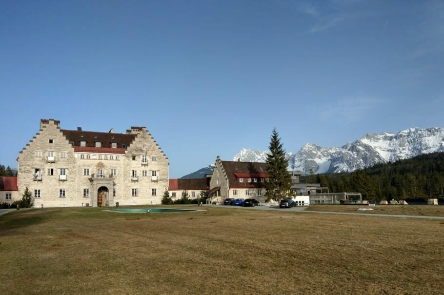
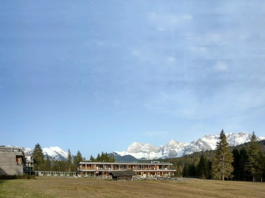
For this reason, I was recently at a photo workshop in the hotel Das Kranzbach in Garmisch-Partenkirchen, which was a pretty successful backdrop for our photographic experiments.
To the workshop
The Kranzbach is one of Germany's best wellness hotels and also has a few smaller ones Meeting-Rooms for exclusive events – I have written in detail over the hideway for stressed managers already two years ago.
The two-day workshop itself was held by my very dedicated and knowledgeable colleagues from the Award Winning Isarblog: Monika Schreiner is a photo editor and works (among others) for WundV or Focus Money, Gerhard Bauer works in sales for a medium-sized company Company. And I have to say that I learned a lot about imagery and current trends in the process.
5 tips for good photos
But what should you pay attention to now, to make your pictures better or more catchy People to reach? My 5 learnings from the workshop are:
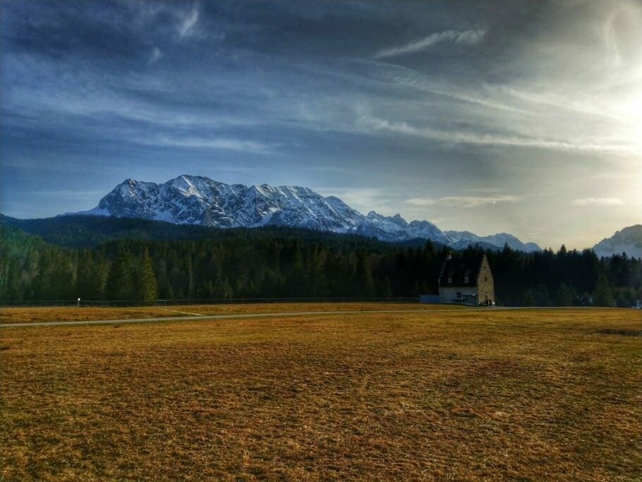
1. Golden cut
In order to make the viewer feel positive, the picture should be as harmonious as possible act. It starts with the Choice the right image section and the design of the image structure: It is ideal if you use the golden section as a guide when taking photos:
This is the division of the image in the ratio 61,8% to 38,2%, also simplified is usually a split ratio of two thirds to one third specified. In our example, this means two-thirds of the sky and one-third of the buildings, mountains and meadow. Of course you can also turn this around (one-third of the sky and mountains, two-thirds of the meadow) or split the picture to the right and left, eg building on the right and sky two-thirds on the left.
Of course, you do not have to stick slavishly to this requirement, especially if it does not fit the picture. The golden section but so well received, has a good reason: This image sharing is perceived by people as particularly harmonious, probably because it occurs so often in nature.
2. Bright photos vs. Dark photos
On Instagram in particular, they are all the rage: light, almost unnaturally pale photos with lots of white and pastel tones. The reason for this, however, is not only aesthetic but also psychological in nature: Bright pictures appear friendlier, more harmonious and therefore arouse more trust, ie they speak to the user in a more positive way Psychology
There are several ways to achieve this typical Instagram aesthetic. For example, by manually adjusting the white balance and exposure time. But even with the finished image, you can still change a lot, for example, by using an app like Lightroom or Photoshop to increase the contrast and then reduce the saturation.
It all looks fancy, but it also gives Instagram a reputation for being an art world that many simply find too unnatural and unrealistic. And since for every movement there is also a counter-movement, it is currently in fashion to photograph objects and landscapes in a particularly dark way, in order to be aware of the artificial Harmony to take off. Dark aesthetics are also very popular in city shots, how this successful example shows.
Of course there is also a psychological background here: Darkness always seems a bit threatening, mystical, dramatic, mysterious, and as a photographer one plays with this fascination. However, the dark effect must be skillfully used - otherwise it can do the opposite!
Which of the trends one ultimately follows, is also a matter of taste, important in the end, above all, a certain consistency in the visual language, practically a separate signature, so that the visitors know who you are.
3. desaturation
Similar to "in" like bright pictures are photos with saturated aesthetics. This means that the color is practically pulled out, instead of colored pop effects, beige, pastel and gray tones dominate in such pictures.
I am often tired of taking out the blue and red tones from a picture with great, bright colors, but I have to admit that my pictures therefore often come in postcard aesthetics. Desaturation, on the other hand, gives the pictures a reduced, noble aesthetic, just as many Instagramers would have it. In addition, you can then highlight certain notes, such as red lips, especially emphasize. A successful Example of this effect can be found here.
At the same time, color reduction can also become a trademark - for example, if the images of an Instagram account dominate grays and reds. This not only creates a stylish appearance but creates a unified look in your account, so to speak, a very unique signature.
4. naturalness
Just Instagram, but also a lot of photo apps now offer great filters, with boring, underexposed shots can conjure up great effects that look good, at least on the small phone screen.
Dramafilters, which increase the contrast, but also various color filters, as I used it in this picture, are particularly popular.
However: You can always see such pictures, that they were edited, my picture was taken here around April, but it looks like in autumn. Although it has received quite a few likes on Instagram, I believe that the trend is long-term to natural-looking images that were processed as discreetly as possible.
5. change of perspective
Which brings me to the final and perhaps most important point I learned in this workshop: you have to decide, whether you want to take pictures that are well received or whether you want to create your own at least occasionally or consistently ways and ideas tracked.
For this, it is advisable to keep the Perspektive to switch to the photographed object and, for example, to climb onto a chair, as we actually did in the workshop.
It sounds so simple, but actually offers the view from the top, completely new, more views and prospects and leads to completely different images.
Conclusion
Of course, there are many other trends and tips that you could handle, writing on picture, for example, which I find increasingly important for Pinterest. Or the game with the background sharpness.
But I thought that we really took a lot of useful tips and suggestions from this workshop and that Kranzbach provided us with a really great backdrop.
Here writes for you
 Simone Janson is publisher, Consultant and one of the 10 most important German bloggers Blogger Relevance Index. She is also head of the Institute's job pictures Yourweb, with which she donates money for sustainable projects. According to ZEIT owns her trademarked blog Best of HR – Berufebilder.de® to the most important blogs for careers, professions and the world of work. More about her im Career. All texts by Simone Janson.
Popular Posts
-
Concepts for failure risk & wrong decisions: the illusion of control

-
Body language & communication for introverts: Gestures, facial expressions, poker face

-
Invest successfully in finance: say no, make money

-
Have analog photos & slides scanned: Mediafix in the test {Trend!-Products}

-
Leadership with confidence: 3 tips for a better leadership style

-
Inner critics releasing blockages & fears: what is your label?

-
The end of the classic career: rise, descent, change?

-
Applicant search on social media: How important is the corporate culture on the internet?


4 Answers to “Marketing & social media communication with pictures: 5 tips for good photos”
-
Great, I've been looking for a good tutorial for instagram for a long time, thank you very much.
-
Thanks a lot for this!
-
-
Great contribution, thanks for the many suggestions!
-
Thank you, we are happy if we can help you.
-
Post a Comment